How To Use Pandas Correlation Matrix
Correlation martix gives us correlation of each variable with each of other variables present in the dataframe. To calculate correlation, we first calculate the covariance between two variables and then covariance is divided by the product of standard deviation of same two variables. Correlation has no units so it is easy to compare correlation coeffient.
In pandas, we dont need to calculate co-variance and standard deviations separately. It has corr() method which can calulate the correlation matrix for us.
If we run just df.corr() method. We would get correlation matrix for all the numerical data.
Let us first import the necessary packages and read our data in to dataframe.
import pandas as pd
from matplotlib import pyplot as plt
I will use students alcohol data which I downloaded from following UCI website...
archive.ics.uci.edu/ml/datasets/student+performance
df = pd.read_csv('student-mat.csv')
df.head(2)
Most of the variables are self explanatory except the following ones...
- G1 - first period grade (numeric: from 0 to 20)
- G2 - second period grade (numeric: from 0 to 20)
- G3 - final grade (numeric: from 0 to 20, output target)
- Mjob - Mothers Job
- Fjob - Fathers Job
corr = df.corr()
For too many variables, correlation matrix would be pretty big. Therefore it is best to visualize the correlation matrix.
To visualize we can use seaborn library.
import seaborn as sns
plt.figure(figsize=(12,8))
sns.heatmap(corr, cmap="Greens",annot=True)
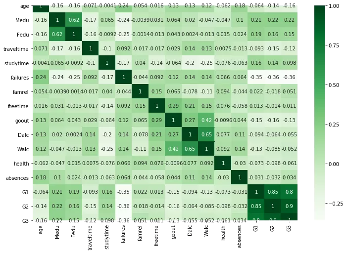
We can ignore the diagonal values, since that is correlation of variable with itself.
values to the left and right of diagonal are mirror image of each other. The greater the correlation between variables, the darker the box is. Therefore we dont need to print the value in each box, since it makes our heatmap ugly. We can look at the color of the box to conclude which are the variables with high correlation.
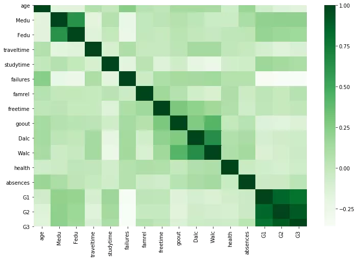
plt.figure(figsize=(12,8))
sns.heatmap(corr, cmap="Greens")
In case you need to print the values of correlation matrix in the descending order. use sort_values() to do that as shown below.
c1 = corr.abs().unstack()
c1.sort_values(ascending = False)
Ofcourse it doesnt make sense to print the diagonal values since they will be 1 any way. Let us just filter out the diagonal values.
corr[corr < 1].unstack().transpose()\
    .sort_values( ascending=False)\
    .drop_duplicates()
From above we can conclude that G3 and G2, G1 and G2, G1 and G3, Dalc and Walc are highly correlated variables.
Related Notebooks
- How To Use Python Pip
- How To Use R Dplyr Package
- How To Use Grep In R
- How To Use Selenium Webdriver To Crawl Websites
- How To Convert Python List To Pandas DataFrame
- How to Export Pandas DataFrame to a CSV File
- How to Sort Pandas DataFrame with Examples
- Pandas How To Sort Columns And Rows
- How To Append Rows With Concat to a Pandas DataFrame