Understanding Logistic Regression Using Python
Logistic Regression is a linear classification model that uses an S-shaped curve to separate values of different classes. To understand Logistic Regression, let's break down the name into Logistic and Regression
What is Logistic
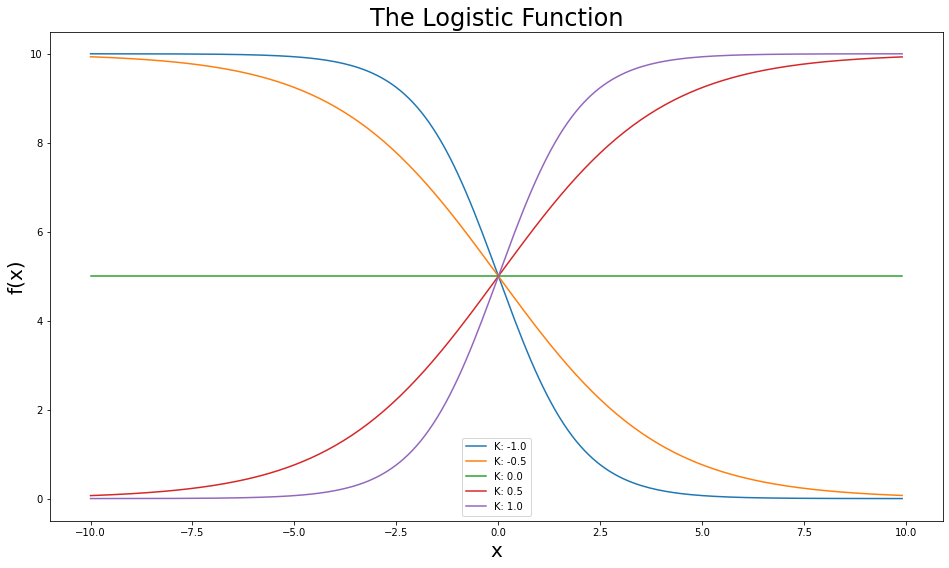
The logistic function is an S-shaped curve, defined as: $$f(x)={\frac {L}{1+e^{-k(x-x_0)}}}$$- $x$ = a real number
- $x_0$ = the x value of the sigmoid midpoint
- $k$ = steepness of the curve (or, logistic growth rate)
- $L$ = the curve's maximum value
Plot Logistic Function in Python
Let us import the Python packages matplotlib and numpy.
import matplotlib.pyplot as plt
import numpy as np
Let us define a Python logistic function using numpy.
def logistic(x, x0, k, L):
    return L/(1+np.exp(-k*(x-x0)))
Let us plot the above function. To plot we would require input parameters x, x0, k and L. I will create some random values using numpy packages. If you want to learn more about generating random numbers in Python, check out my post https://www.nbshare.io/notebook/572813697/How-to-Generate-Random-Numbers-in-Python/
x = np.arange(start=-10, stop=10, step=0.1)  # an array from -10 to 10 with a step of 0.1

x0 = 0  # the midpoint of the S curve is 0
L = 10  # maximum point of the curve

ks = np.arange(start=-1, stop=1.1, step=0.5) # different steepness values to plot

plt.figure(figsize=(16, 9))
for k in ks:
    f_x = logistic(x=x, x0=x0, k=k, L=L)
    plt.plot(x, f_x, label=f"K: {k}")

plt.title("The Logistic Function", fontsize=24)
plt.ylabel("f(x)", fontsize=20)
plt.xlabel("x", fontsize=20)
plt.legend()
plt.show()
What is Regression
Linear Regression is the process of fitting a line that best describes a set of data points.
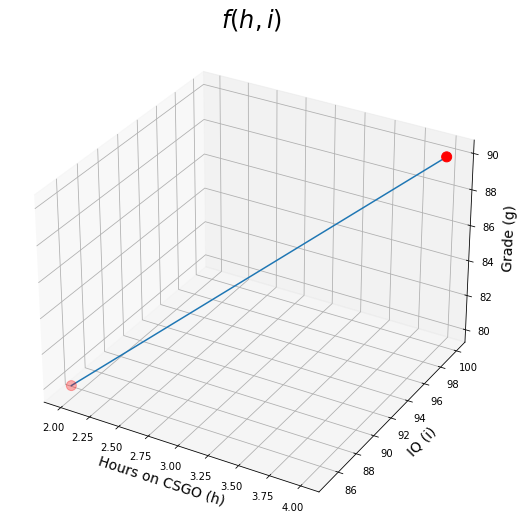
Let's say you are trying to predict the Grade g of students, based on how many hours h they spend playing CSGO, and their IQ scores i. So you collected the data for a couple of students as follows:
You then laid out this data as a system of equations such as: jjf(h,i)=h.θ1+i.θ2=g where θ1 and θ2 are what you are trying to learn to have a predictive model. So based on our data, now we have: 2θ1+85θ2=80 and 4θ1+100θ2=90 We can then easily calculate θ1=−2.5 and θ2=1.
So now we can plot f(h,i)=−2.5h+i
Plot Regression Function in Python
Ok, let us create a sample data. We will plot (3d graph) for CSGO (game) hours spent vs student grades.
Let us define a simple regression function in Python which will take two inputs, number of hours(h) and IQ (i). The below function calculates the student's grade based on gaming hours and his IQ level.
def grade(h, i):
    return -2.5 * h + i
from mpl_toolkits.mplot3d import Axes3D
fig = plt.figure(figsize=(16,9))
ax = fig.add_subplot(111, projection='3d')
h = np.array([2, 4]) # hours on CSGO from 0 to 10
i = np.array([85, 100]) # IQ from 70 to 130
grades = grade(h, i)
ax.plot(h, i, grades)

ax.scatter([2, 4],[85,100], [80, 90], s=100, c='red') # plotting our sample points

ax.set_xlabel("Hours on CSGO (h)", fontsize=14)
ax.set_ylabel("IQ (i)", fontsize=14)
ax.set_zlabel("Grade (g)", fontsize=14)
plt.title(r"$f(h,i)$", fontsize=24)
plt.show()
What we did so far can be represented with matrix operations. We refer to features or predictors as capital $X$, because they usually are more than one dimension (for example hours on CSGO is one dimension, and IQ is another). We refer to the target variable (in this case the grades of the students) as small $y$ because y typically is one dimension. So, in matrix format, that would be: $$X\theta=y$$ THIS EQUATION IS THE NUTSHELL OF SUPERVISED MACHINE LEARNING
However, typically we don't just have 2 data points that we are trying to connect. We can have hundreds of thousands of points, and it might be the case that there does not exist a line which can pass through all the points simultaneously. This is where we use line-fitting.
- We start by setting the θ values randomly.
- We use the current value of θ to get the predictions.
- We calculate the error by taking the mean of all the squared differenes between the predictions and labels (also called mean squared error MSE) MSE=1nn∑i=1(yi−^yi)2 where n is the number of data points, yi is one label, and ^yi is the prediction for that label.
- We use the error calculated to update θ and repeat from 2 to 3 until θ stops changing.
There are different ways of evaluating the error, including least squares R2, mean absolute error MAE, and root mean squared error RMSE.
What is Logistic Regression
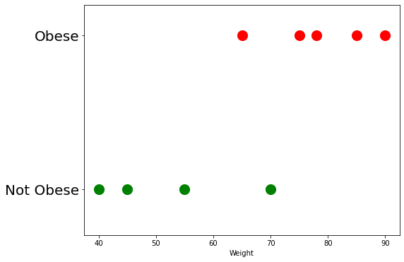
Let's assume you collected the weight all your classmates, and trying to build an obesity classif0iier. Having more weight does not necessarily mean someone is obese as they might just be very tall or muscular. So the data looks something like this...# Obese/not Obese: [list of weights in KGs]
data = {
"Obese":[65, 75, 78, 85, 90],
"Not Obese":[40, 45, 55, 70]
}
ok, let us create a scatter plot using the above data above. I have created a plot_data() function to create this scatter plot.
def plot_data():
    plt.figure(figsize=(8,6))
    plt.scatter(data["Obese"], [1]*len(data["Obese"]), s=200, c="red")
    plt.scatter(data["Not Obese"], [0]*len(data["Not Obese"]), s=200, c="green")
    plt.yticks([0, 1], ["Not Obese", "Obese"], fontsize=20)
    plt.ylim(-0.3, 1.2)
    plt.xlabel("Weight")
The plot_data() function creates a scatter plot. In the below code, we are invoking the function plot_data() which will create the scatter plot.
plot_data()
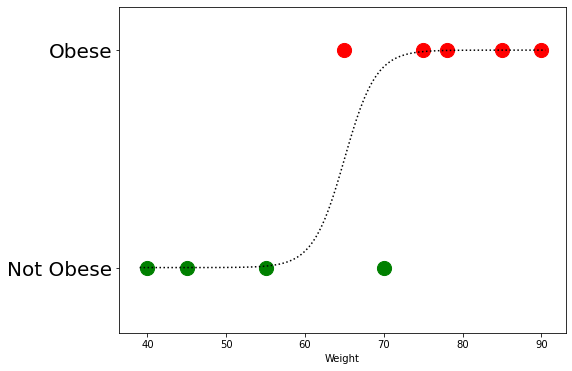
We can now try to fit a curve to this data using the logistic function that we created in the beginning of this post.
Let us create input data for our logistic function. Since we know that our data (obese + non obese) has values ranging from 40 to 90, we can create a numpy array for this range as shown below. This will be our x. X0 is midpoint of our data which would be 65.
np.arange(39, 91, 0.5)
Let us fit the curve now to our data.
plot_data()
x = np.arange(39, 91, 0.5)
l = logistic(x, x0=65, k=0.5, L=1)
plt.plot(x,l, 'k:')
plt.show()
To best fit this curve, similar to linear regression we start with random parameters ($K$, $L$, $x_0$) for the logistic function, calculate the error, and update the parameters of the function. However, this time, the error is not simply how far is the label from the prediction, so we can't use MSE or $R^2$. Instead we use Maximum Likelihood (ML).
What is Maximum Likelihood
Ok You do not necessarily need to completely understand (ML), but in a nutshell, we can understand it through a nice plot.
Check out the curve drawn above.
We can calculate the likelihood of each point in our training data of being non-obese. How do we do that? Use the curve! Yes, that curve is basically the probability scaled by the features (which is in this example, the weight). You calulate the likelihoods of all the data points, and there you go, that's the likelihood of that line fitting your data, and that's what we are trying to maximize, hence the name maximum likliehood.
Computationally speaking, all we need to change from linear regression is the error function, so now it will look like:
$$-\frac{1}{n}\sum_{i=1}^N{y_i\log(\hat{y_i})+(1-y_i)\log(1-\hat{y_i})}$$don't be afraid of this lengthy equation, it just is the multiplication of the predicted probability that an individual is obese $y_i$, with its log $\log(\hat{y_i})$, plus its counter part for the probability of observing a non-obese, which is $1-\hat{y_i}$
How to Use Logistic Regression as Classifier
Let's now try Logistic Regression to classify a dataset in python- We will use scikit-learn's implementation, which you can find here
- We will use Breast Cancer Wisconsin Dataset.
from sklearn.datasets import load_breast_cancer
from sklearn.linear_model import LogisticRegression
from sklearn.metrics import accuracy_score
from sklearn.model_selection import train_test_split
X, y = load_breast_cancer(return_X_y=True)
We notice that there are a total of 30 features and 569 samples.
X.shape
Don't forget to split your data into train and test, so when you evaluate the model you would be using some novel data the model has not seen before. This, in turn, gives you a more reliable evaluation of the model's performance.
X_train, X_test, y_train, y_test = train_test_split(X, y)
To build a logistic regression model, we ... hold on, it is just two lines.
model = LogisticRegression(max_iter=10000, n_jobs=-1) # one ...
# fit the curve
model.fit(X_train, y_train) # two. That's it!
- We can increase the number of maximum iterations to let the model train more
- n_jobs is basically how many CPU cores you want to use for training.
- I use -1, which means use all CPU cores available. so if you have 8 cores, it will train 8 times faster than if you trained on a single core.
# let's make our predictions
predictions = model.predict(X_test)
# let's see our accuracy
print(accuracy_score(y_test, predictions))
Wohoo, we got +97% accuracy!
Summary
- Logistic Regression (LR) is the process of maximizing the likelihood of a logistic curve to fit the data.
- It is a linear model, because we don't do any non-linear transformation on the data.
Related Notebooks
- How To Run Logistic Regression In R
- Regularization Techniques in Linear Regression With Python
- Understanding Word Embeddings Using Spacy Python
- Decision Tree Regression With Hyper Parameter Tuning In Python
- Machine Learning Linear Regression And Regularization
- Lasso and Ridge Linear Regression Regularization
- How To Add Regression Line On Ggplot
- Crawl Websites Using Python
- TTM Squeeze Stocks Scanner Using Python