knitr::opts_chunk$set(echo = TRUE)
Introduction to ggplot2
The R ggplot2 is one of its most popular and widely used packages. It provides a powerful and customizable data visualization tool. The ggplot2 package can be used to plot a dataset. It uses geoms which are visual markers for data points and a coordinate system. Proper visualization can give you a deeper insight into your data. Making informative and pleasing graphs is more of an art than science since it is a form of communication. Data visualization is the area of data analysis where you can show your creative skills.
Install ggplot2
Before using ggplot2 it is necessary to install it, since it is not a part of base R. The ggplot2 package is hosted in the CRAN repository. Any package from the CRAN repository can be installed using the function install.packages(). Since ggplot2 is part of the wider tidyverse, you can either choose to install tidyverse or just the ggplot2 package itself.
install.packages("ggplot2")
Alternatively, we can install the tidyverse collection of packages, which will also include ggplot2.
install.packages("tidyverse")
Tip:
This is a useful chunk of code to make sure all the packages you want to use are installed if they are not already installed.
list_of_packages <- c("dplyr", "ggplot2")
new_packages <- list_of_packages[!(list_of_packages %in% installed.packages()[,"Package"])]
if(length(new_packages)) install.packages(new_packages)
library("ggplot2")
head(mtcars)
Let us try to visualize the relationship between the weight (wt) and mile-per-gallon (mpg). We should expect to see a negative correlation. When building your graphs, always start with the ggplot() function.
- The first argument is the data, in our case mtcars.
- The second argument in the ggplot function is the aes() function, short for aesthetics. This function describes how variables in the data will be linked to geoms, the visual marks representing our data on the graph.
In our example we specify the x axis as the mpg column, and y axis as the wt column of the mtcars dataset. Lastly we need to add a geom. Let us make a scatterplot first, for this we will need our geoms to be points and for that we will use the geom_point function. This function will be a new layer to our graph, which we will initialize using ggplot(). Using the "+", we add the new layer.
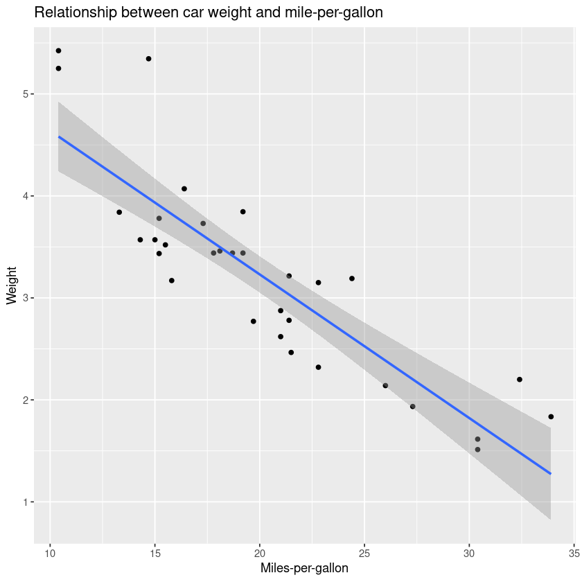
ggplot(mtcars, aes(x = mpg, y = wt)) + geom_point()
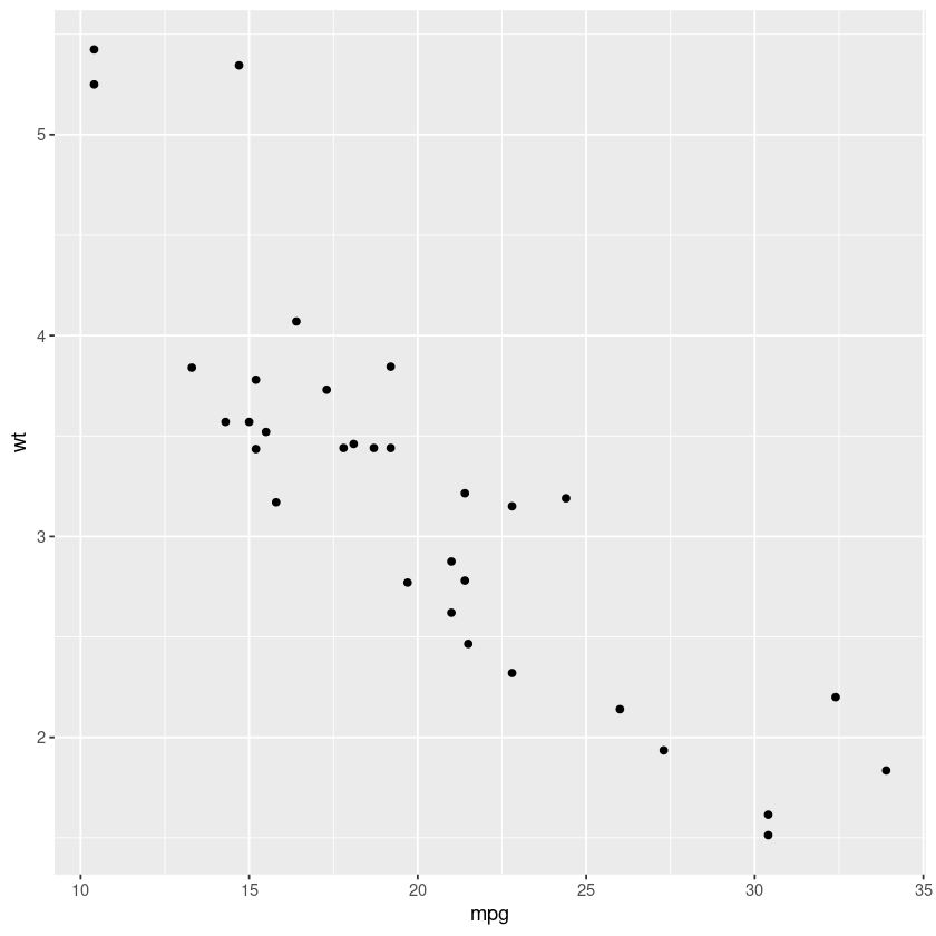
And there we have it, our very first graph! Also notice the negative correlation between the car weight and mpg. For now the relationship is clear, but sometimes with too many data points, it is hard to visualize. We can smooth these points out using the geom_smooth() function which can use different methods. For now let us use linear regression.
ggplot(mtcars, aes(x = mpg, y = wt)) + geom_point() + geom_smooth(method = "lm")
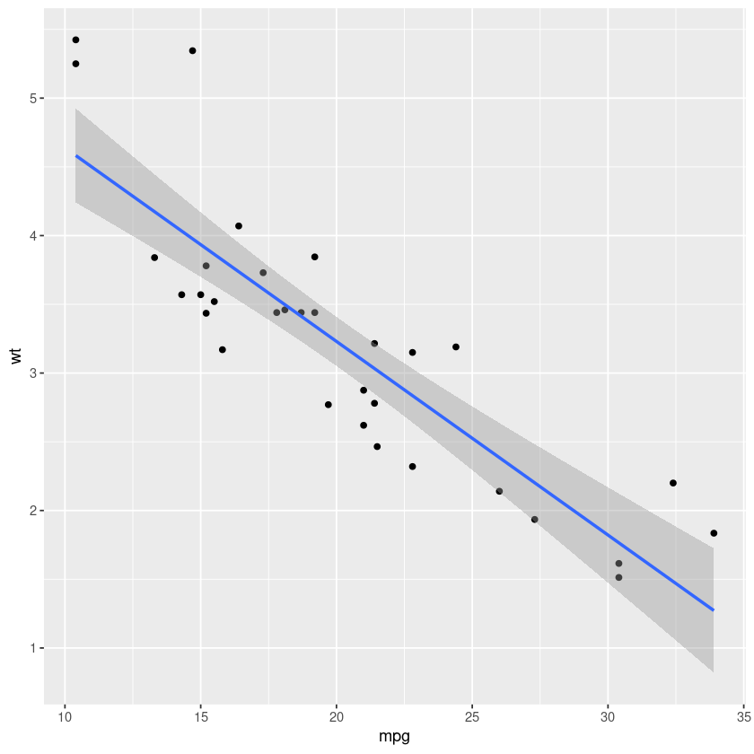
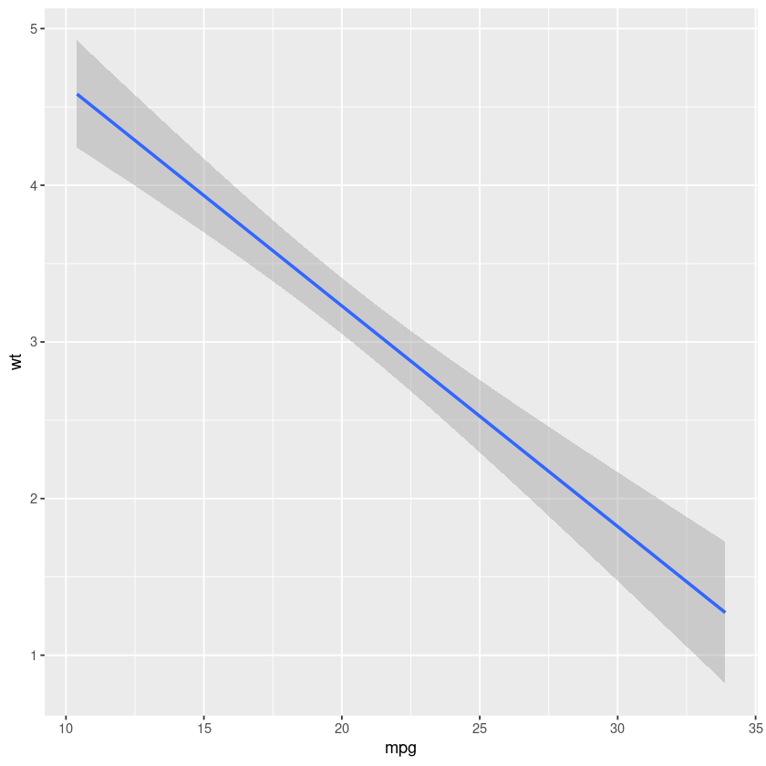
Notice how we added a new layer with the "+" sign to our already existing graph. We can remove our previous layer and we will also have a graph, albeit without points.
ggplot(mtcars, aes(x = mpg, y = wt)) + geom_smooth(method = "lm")
The entire graph can be stored in an variable.
my_first_graph <- ggplot(mtcars, aes(x = mpg, y = wt)) + geom_point() + geom_smooth(method = "lm")
New layers can be added to your graph that is stored inside a variable. For example, We can add a title to our graph with ggtitle().
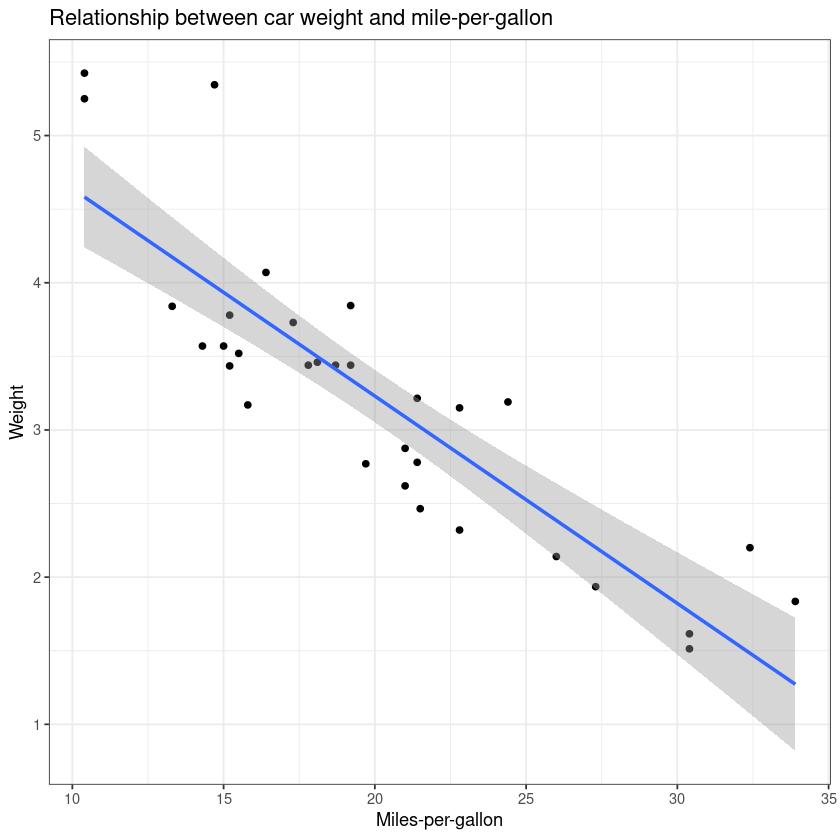
my_first_graph + ggtitle("Relationship between car weight and mile-per-gallon")
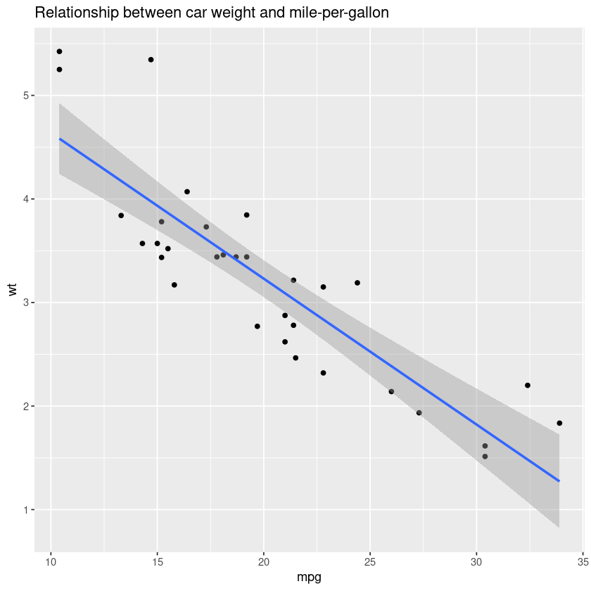
The x and y axis names are inherited from column names specified in aes() unless overwritten. Our graph should be as informative as possible, so we should change our axis labels to something more descriptive. Axis labels can be changed using the xlab() and ylab() functions.
my_first_graph + ggtitle("Relationship between car weight and mile-per-gallon") +
  xlab("Miles-per-gallon") +
  ylab("Weight")
my_first_graph <- my_first_graph + ggtitle("Relationship between car weight and mile-per-gallon") +
  xlab("Miles-per-gallon") +
  ylab("Weight") +
  theme_bw()

my_first_graph
ggsave("my_first_graph.jpeg", #name of the file
       my_first_graph,#the graph you want to save
       device = "jpeg") #file format
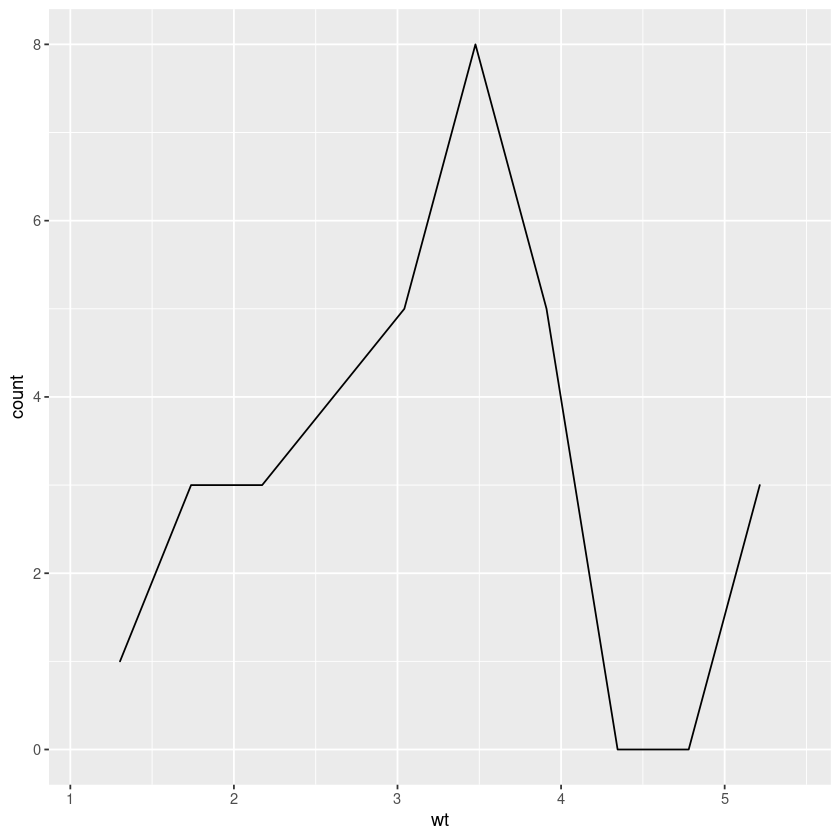
single_continous_variable <- ggplot(mtcars, aes(wt))
single_continous_variable + geom_area(stat = "bin")
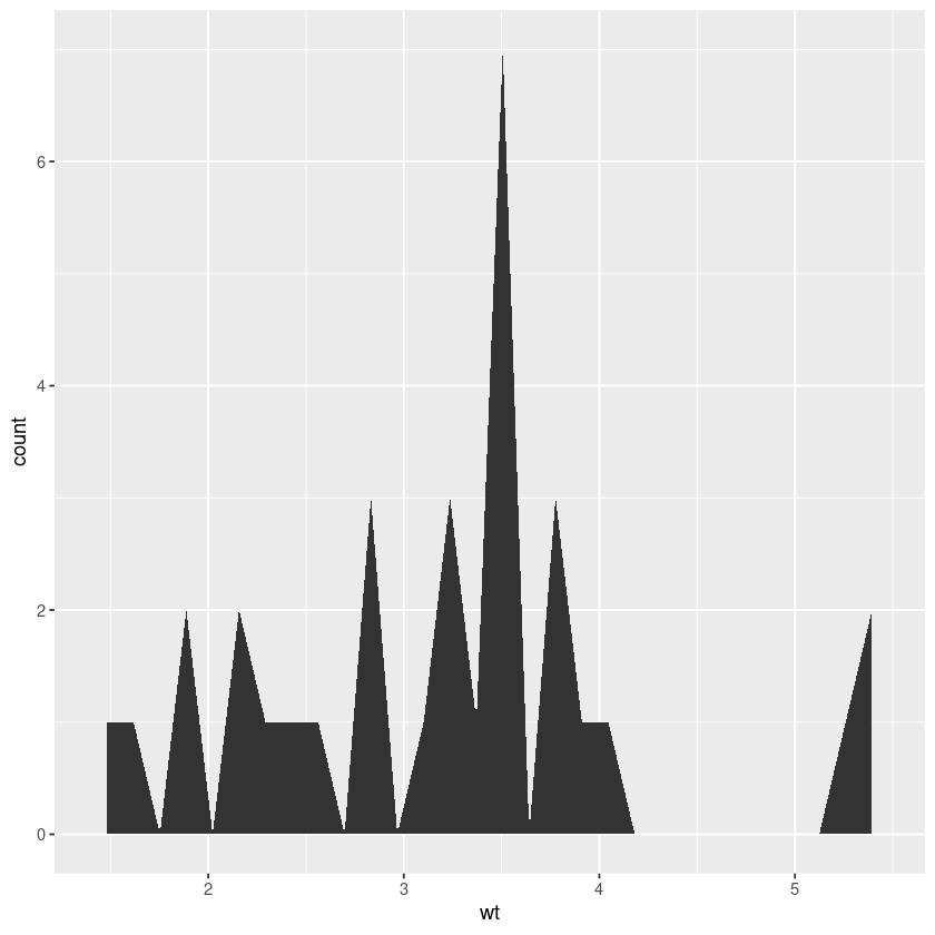
"bin" option allows us to bin values in to number of bins and plot their frequencies.
You can see the default values with the message: stat_bin() using bins = 30. Pick better value with binwidth.
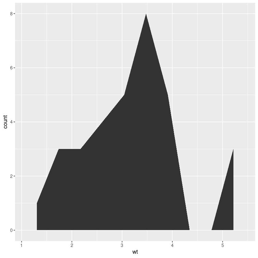
Let us try setting a lower number of bins to draw a continous plot.
single_continous_variable + geom_area(bins=10,stat = "bin" )
A density plot with geom_density().
single_continous_variable + geom_density(bins=10,stat = "bin" )
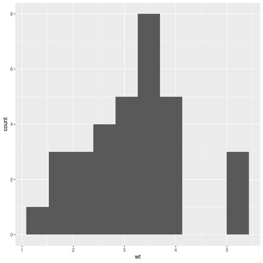
A histogram with geom_histogram().
single_continous_variable + geom_histogram(bins=10,stat = "bin" )
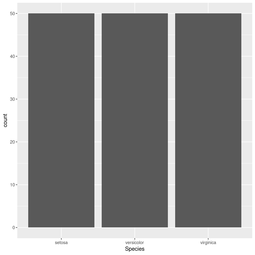
ggplot(iris, aes(Species)) + geom_bar()
Plotting two variables
Both continous variables
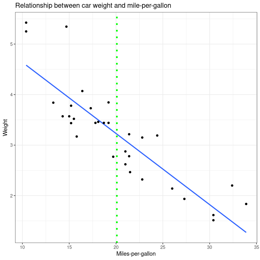
Plotting two continous variables is best accomplished using geom_point() in order to make a scatter plot. We already covered making this kind of plot in our "Making a basic graph" section. So here we can try to add some more layers and improve our first graph.
ggplot(mtcars, aes(x = mpg, y = wt)) +
  geom_smooth(method = "lm", se = F) + # se = F: turn off confidence interval
  geom_point() +
  ggtitle("Relationship between car weight and mile-per-gallon") +
  xlab("Miles-per-gallon") +
  ylab("Weight") +
  geom_vline(xintercept = mean(mtcars$mp), linetype="dotted",
                color = "green", size=1.5) + # add a x intercept line
  theme_bw()
To wrap up, we will draw a grouped boxplot using iris data set.
head(iris)
Here we see a dataframe in a wide format, meaning every row represents the measurements of the different characteristics of a plant. Here each variable represents a column. In order to make a grouped boxplot we need to change this dataframe into a long format.
We can use the melt() function to convert the iris dataframe into a long format. The long format has for each data point as many rows as the number of variables and each row contains the value of a particular variable for a given data point. The melt() function is part of the reshape2 package so we will first load it.
library(reshape2)
iris_long <- melt(iris)
head(iris_long)
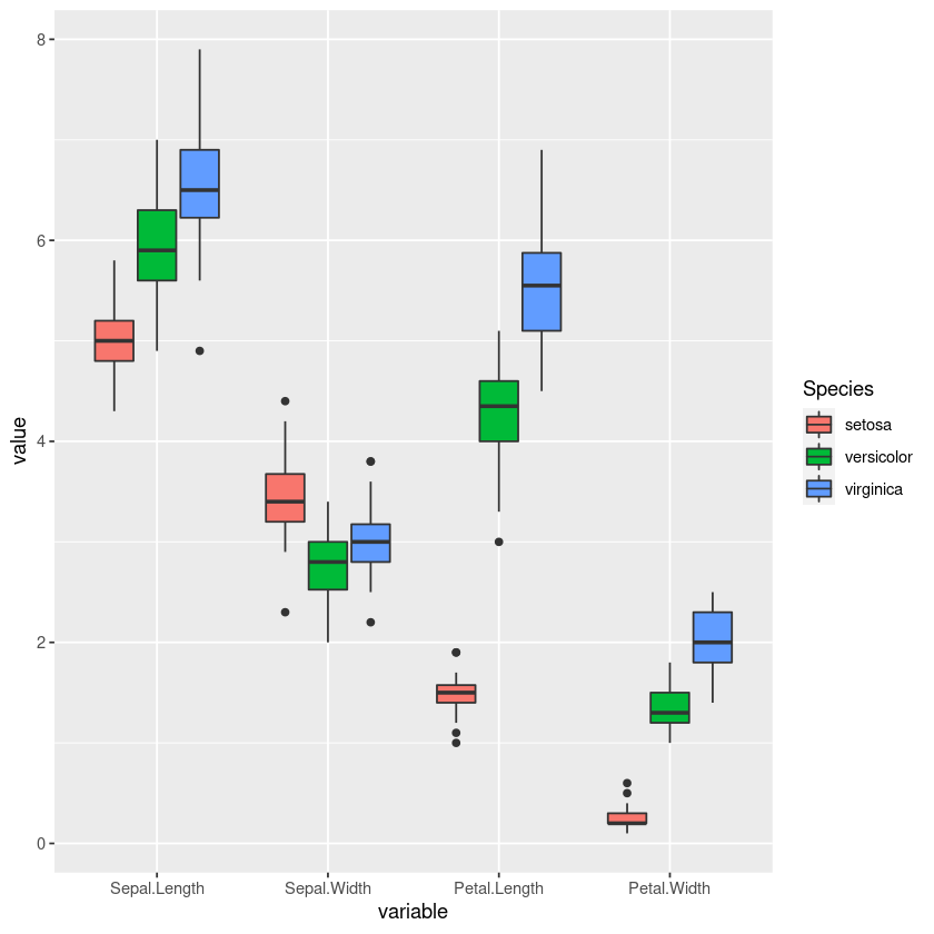
With geom_boxplot() we can create a boxplot. Boxplots provide additional information about our data. The horizontal black line represent the median value,the top and bottom borders of the "box" represent first and third quartiles. The extent of the vertical line marks the quartile + 1.5 * interquartile range. Dots beyond these points are considered outliers.
ggplot(iris_long, aes(x = variable, y = value, fill = Species )) + geom_boxplot()
Related Notebooks
- Introduction To R DataFrames
- How To Write DataFrame To CSV In R
- How To Convert Python List To Pandas DataFrame
- How To Use Selenium Webdriver To Crawl Websites
- How to Export Pandas DataFrame to a CSV File
- Best Approach To Map Enums to Functions in Python
- Python Pandas String To Integer And Integer To String DataFrame
- How To Append Rows With Concat to a Pandas DataFrame
- How to Upgrade Python PIP