How to Plot a Histogram in Python
Plotting a histogram in python is very easy. I will talk about two libraries - matplotlib and seaborn. Plotting is very easy using these two libraries once we have the data in the Python pandas dataframe format.
I will be using college.csv data which has details about university admissions.
Lets start with importing pandas library and read_csv to read the csv file
import pandas as pd
df = pd.read_csv('College.csv')
df.head(1)
Ok we have the data in the dataframe format. Lets start with our histogram tutorial.
How to plot histogram in Python using Matplotlib
Lets first import the library matplotlib.pyplot.
Note:You don't need %matplotlib inline in Python3+ to display plots in jupyter notebook.
import matplotlib.pyplot as plt
Lets just pick one column from dataframe and plot using matplotlib. We will use plot() method which can be used both on Pandas Dataframe and Series. In the below example, we are applying plot() on Pandas Series data type.
There are two ways to use plot() method. Either directly on the dataframe or pass dataframe to plt.plot() function.
Lets first try the dataframe.plot() method.
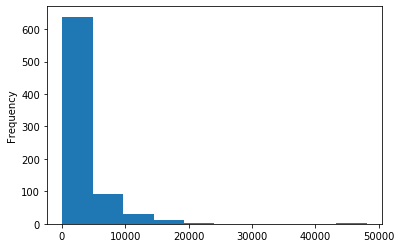
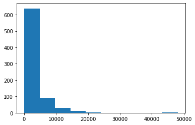
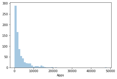
df['Apps'].plot(kind='hist')
df.plot() has many options. Do df.plot? to find the help and its usage.
One important parameter when plotting a histogram is number of bins. By default plot() divides the data in 10 bins.
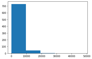
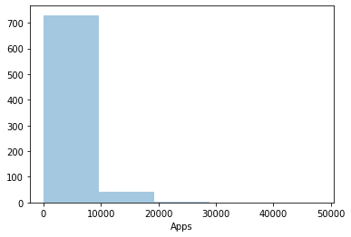
We can control this parameter using bins parameter. Lets try bins=5
df['Apps'].plot(kind='hist',bins=5)
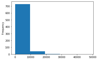
Note the difference we see only two bars and bars look bigger, if we increase the plot() number of bins, we would see more number of smaller bars becasue the data will be divided in two more number of bins. We can see data more granularally.
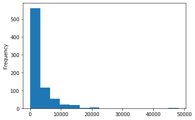
df['Apps'].plot(kind='hist',bins=15)
Ok thats that. Lets try plt.plot() method. This gives us more flexibility and more options to control the plot figure. Lets start simple and use plt.plot() method to draw the histogram of the same column.
plt.plot(df['Apps'])
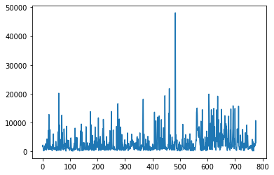
Oops, we got the line plot. For histogram plotting, there is hist() method of pyplot. Lets try that.
plt.hist(df['Apps'])
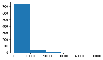
Ok we got our histogram back. We can pass in the bins parameter to pyplot to control the bins.
plt.hist(df['Apps'],bins=5)
Matplotlib is a great package to control both axes and figure of the plot. By the way, figure is the bounding box and axes are the two axes, shown in the plot above. Matplotlib gives access to both of these objects. For example we can control the matplotlib figure size using figsize options.
fig, ax = plt.subplots(figsize=(5,3))
plt.hist(df['Apps'],bins=5)
As you noted above the size of the plot has been reduced. There is much that we can do with fig,ax objects. I will have to write a complete series on it to touch upon those options. Lets just for now move on to 2nd way of plotting the python plots.
How to plot histogram in Python using Seaborn
Matplotlib where gives us lot of control, Searborn is quick and easy to draw beautiful plots right out of the box.
Lets just import the library first.
import seaborn as sns
Searborn has named it distplot instead of hist plot. displot stands for distribution plot.
sns.distplot(df['Apps'])
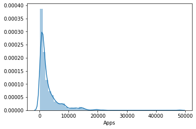
If you see above, the seaborn distribution plot looks quit different from the matplotlib histogram plot. The line over the histogram is called density line. Lets just remove the line with option kde=False.
sns.distplot(df['Apps'],kde=False)
The y axis also looks better in seaborn plot. With kde=True, seaborn was showing density on the yaxis as opposed to frequency.
As usual, we can control the bins with bins option in seaborn. Lets try bins=5.
sns.distplot(df['Apps'],kde=False,bins=5)
Remember seaborn uses matplotlib objects under the hood. Therefore we can still control the plot using pyplot object.
sns.distplot(df['Apps'],kde=False,bins=5)
plt.xlabel('No of Univ Applications')
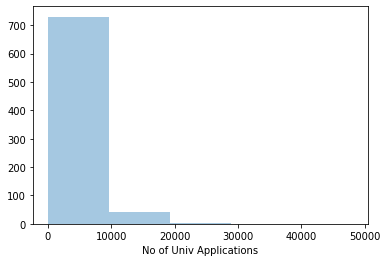
As we see above, we changed the x-axis label by using the xlabel method of plt.
Wrap Up!
In the above tutorial, I have shown you how to plot histograms in Python using two libraries Matplotlib and Seaborn . Hope you would find it useful.
Related Notebooks
- How To Plot Histogram In R
- How To Plot Unix Directory Structure Using Python Graphviz
- How To Iterate Over Rows In A Dataframe In Pandas
- How to Convert Python Pandas DataFrame into a List
- Five Ways To Remove Characters From A String In Python
- How to Export Pandas DataFrame to a CSV File
- How To Append Rows With Concat to a Pandas DataFrame
- A Study of the TextRank Algorithm in Python
- Return Multiple Values From a Function in Python