How To Plot Histogram In R
Histograms are powerful visualization tools to analyze and present data. For this example I will use covid19 data.
To read directory from JSON API, i will use jsonlite library. If you don't have jsonlite installed, install it using library.install("jsonlinte")
library(jsonlite)
url <- "https://pomber.github.io/covid19/timeseries.json"
covid_data <- fromJSON(url,flatten = TRUE)
Ok we have the JSON data in the variable covid_data. Let us check the names that is "columns" in our data. Let us check the value of ist column.
names(covid_data)[1]
Ok we have covid19 data by countries. Let us print the first row of the covid19 US data.
head(covid_data$US,1)
As we can see above, data per country is a dataframe. Now we can easily plot the histogram using the R hist() function. Let us draw a histogram of covid19 conirmed cases of country Italy.
hist(covid_data$Italy$confirmed)
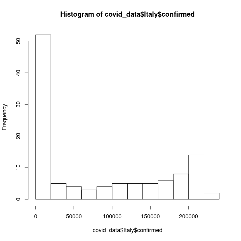
The y-axis shows the frequency distribution.
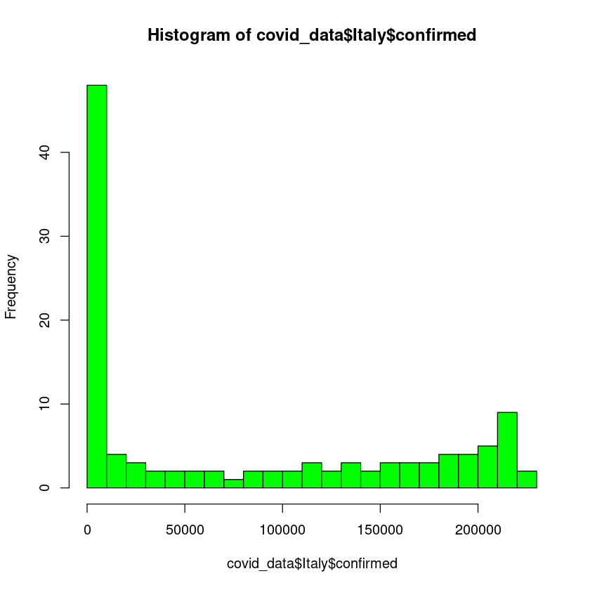
We can change the appearance of the histogram. Let us color it green. Also we can define the bins/breaks. We can define bins by specifying option breaks.
hist(covid_data$Italy$confirmed, breaks = 20, col = "green")
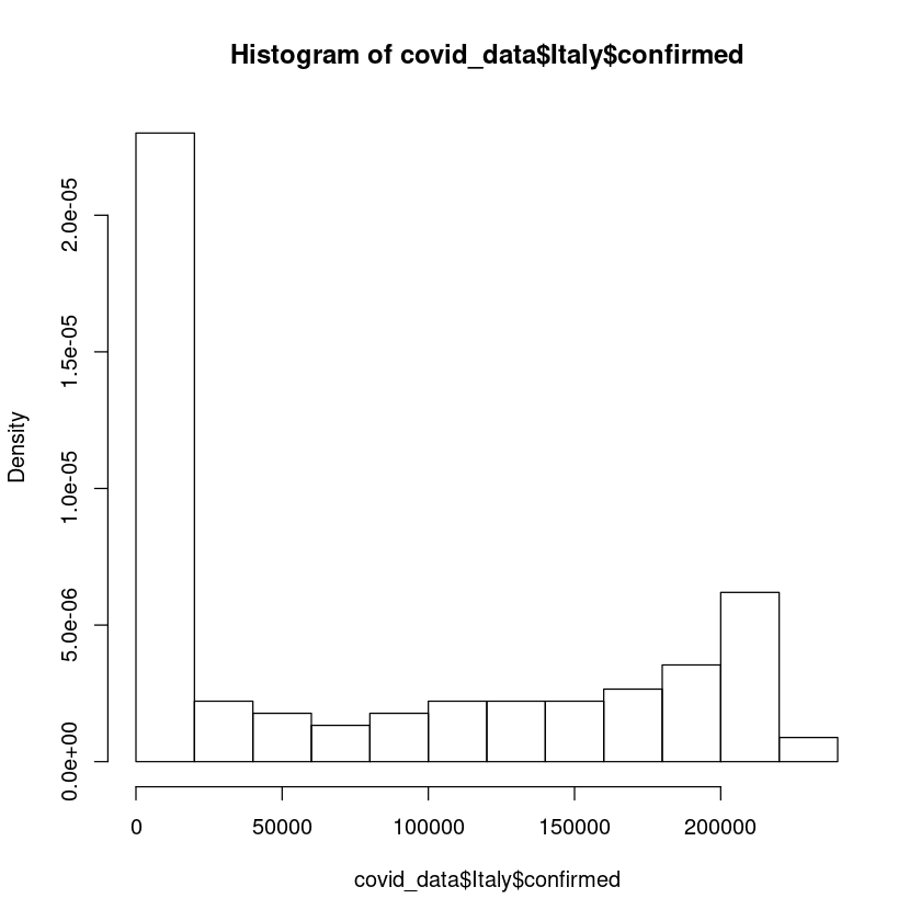
Also instead of frequency distribution, we can change the y-axis to probability distribution.
hist(covid_data$Italy$confirmed,freq = FALSE)
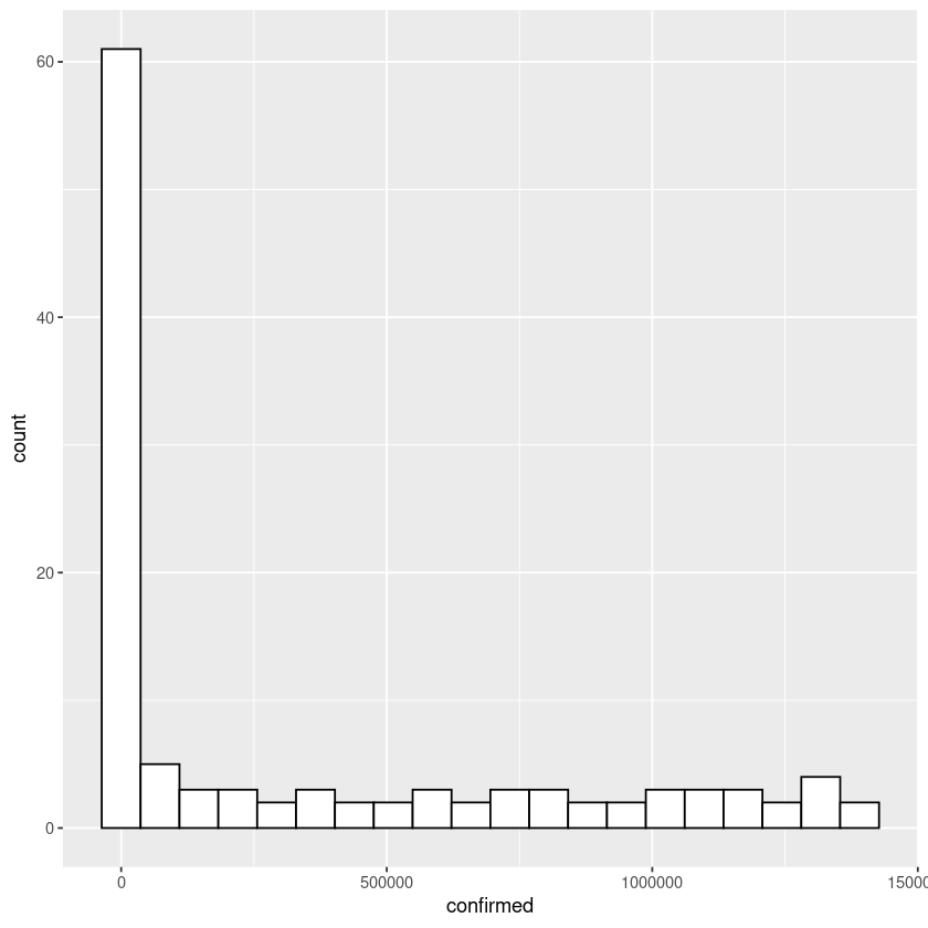
How to plot histogram in R using ggplot
Let us first import the package ggplot. If you dont have ggplot installed. Install using install.packages("ggplot") in your R repl.
library(ggplot2)
Let us plot the histogram of confirmed US covid19 cases. Note below we are passing the data to ggplot function and also adding geom_histogram figure to the plot function.
ggplot(covid_data$US,aes(x=confirmed)) + geom_histogram(bins = 20,color="black",fill="white")
How about plotting two histograms in the same graph. Let us plot the histogram of US recovered and number of deaths in the same graph.
ggplot(covid_data$US) + geom_histogram(aes(x=recovered),bins = 20,color="black",fill="green",position = "stack",alpha=0.2) +
                        geom_histogram(aes(x=deaths),bins = 20,color="black",fill="red",position = "stack",alpha=0.2)
In the command above, we have added two figures to the ggplot. First figure is for the histogram of 'recovered' cases and second figure is for the histogram of 'deaths'. Also note the option alpha=0.2, this will make overlapping regions visible.
Also note aes option which is aesthestic group. This option is responsible for setting various variables which controls the graph. Check out following link for details ggplot2.tidyverse.org/reference/aes_group_order.html
Let us do one last example. In this one, we will draw histograms of recovered cases for country US and Italy and plot the histograms in the same graph.
ggplot() + geom_histogram(data = covid_data$US, aes(x=recovered),bins = 20,color="black",alpha = 0.2,fill="red",position = "dodge") +
                        geom_histogram(data=covid_data$Italy,aes(x=recovered),bins = 20,alpha = 0.2,color="black",fill="green",position = "dodge")
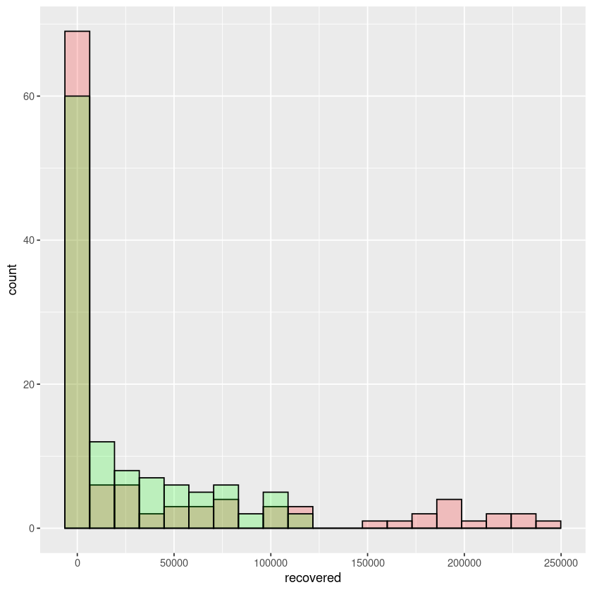
In the above example notice, we are plotting the covid19 data of recovered cases of both US and Italy in the same graph.
Wrap Up!
I hope you would find this tutorial useful.
Related Notebooks
- How to Plot a Histogram in Python
- How To Plot Unix Directory Structure Using Python Graphviz
- How To Write DataFrame To CSV In R
- How To Use Grep In R
- How To Iterate Over Rows In A Dataframe In Pandas
- How to Generate Random Numbers in Python
- How To Run Logistic Regression In R
- How to Create DataFrame in R Using Examples
- How To Replace na Values with Zeros In R Dataframe