How to Analyze the CSV data in Pandas
For this exercise, I am using College.csv data. The brief explantion of data is given below.
import pandas as pd
df = pd.read_csv('College.csv')
df.head()
Description Of Data Private : Public/private indicator
Apps : Number of
applications received
Accept : Number of applicants accepted
Enroll : Number of new students enrolled
Top10perc : New students from top 10% of high school class
Top25perc : New students from top 25% of high school class
F.Undergrad : Number of full-time undergraduates
P.Undergrad : Number of part-time undergraduates
Outstate : Out-of-state tuition
Room.Board : Room and board costs
Books : Estimated book costs
Personal : Estimated personal spending
PhD : Percent of faculty with Ph.D.’s
Terminal : Percent of faculty with terminal degree
S.F.Ratio : Student/faculty ratio
perc.alumni : Percent of alumni who donate
Expend : Instructional expenditure per student
Grad.Rate : Graduation rate
Lets look at the summary of data by using describe() method of pandas
df.describe()
Lets fixed the University name column which is showing up as Unnamed.
df.rename(columns = {'Unnamed: 0':'University'},inplace=True)
Lets check if the colunm has been fixed
df.head(1)
We can plot few columns to understand more about the data
Lets look at the plot between column Phd and column Grad.Rate
Lets fix the column names which have dot in it and replace them with underscore _
df.rename(columns=lambda x: x.replace(".","_"),inplace=True)
Lets checkout the column names now
df.columns
Ok we see dot now replaced with underscore now. We can do the plotting now. We will use library seaborn to plot.
import seaborn as sns
sns.scatterplot('PhD','Grad_Rate',data=df)
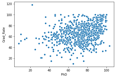
Above is a simple plot which shows Grad_Rate on Y axis and PhD on x axis. In the command sns.scatterplot('PhD','Grad_Rate',data=df) , we supplied the column names and supplied dataframe df to the data option
Lets do another query to see how many of these colleges are private. This is equilavent to SQL select statement which is 'select count(colleges) from df where private="yes"'. Let us see how can we do this in pandas very easily
len(df[df.Private=="Yes"])
Lets do another query. How many universities have more than 50% of students which were among the top 10% in the high school.
To run this query, we will have to look at variable Top10perc. Let us create a new column and call it Elite.
df['elite'] = df.Top10perc > 50
Lets print the first 5 rows to see what we got. We should see elite column with True and False values.
df.head(5)
Yes thats what we got.
Lets check out how many elite universities we got. We can again use the describe() function. But since elite is not a numerical method, therefore we can't use directly the describe() method. elite is a category variable. Therefore we will have to use groupby() method first and then apply count() method. lets see how it works.
df.groupby('elite')['University'].count()
How to Use Searborn Plots to Analyze the CSV data
Lets see now how can we use plot to analyze the data. As we saw above seaborn is a great utility to plot data.
Lets do historgram plot for the query df.groupby('elite')['University'].count()
import matplotlib.pyplot as plt
sns.countplot(df['elite'],hue=df['elite'])
plt.show()
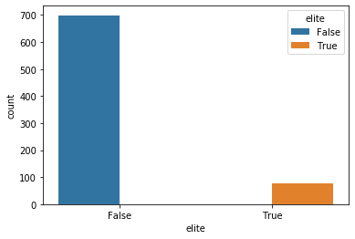
As we see above, historgram is showing us True and False count for the column elite
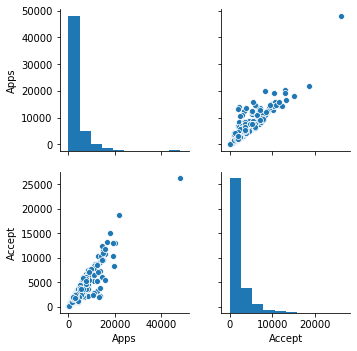
Lets do a scattorplot matrix using seaborn
sns.pairplot(df)
I got following error
TypeError: numpy boolean subtract, the - operator, is deprecated, use the bitwise_xor, the ^ operator, or the logical_xor function instead.
The above error is because we have wrong data type that is the new category variable "elite" we created. Lets exclude that variable and plot it again.
But how would we just exclude one column in Pandas. Lets try following...
df.loc[:, df.columns != 'elite'].head(1)
Ok Lets check we can pass this dataframe to seaborn.
sns.pairplot(df.loc[:, df.columns != 'elite'])
The above command worked, not showing the plot because of the size of the plot, lets just select 2 columns and then plot it.
sns.pairplot(df.loc[:,['Apps','Accept']])
Related Notebooks
- How To Analyze Wikipedia Data Tables Using Python Pandas
- How To Analyze Data Using Pyspark RDD
- How To Analyze Yahoo Finance Data With R
- How To Write DataFrame To CSV In R
- How to Export Pandas DataFrame to a CSV File
- How To Read JSON Data Using Python Pandas
- How To Read CSV File Using Python PySpark
- Analyze Corona Virus Cases In India
- Save Pandas DataFrame as CSV file