How To Add Regression Line On Ggplot
Let us import the neccessary packages first.
In [11]:
library(ggplot2)
library(dplyr)
library(lubridate)
For the example data, we would analyze the covid19 data which is available on the github. We would do a line plot of monthly US data and then plot regression line on top of that plot.
In [2]:
url <- "https://pomber.github.io/covid19/timeseries.json"
covid_data <- fromJSON(url,flatten = TRUE)
covid_data dataframe has data for all the countries, let us look at the data for US only.
In [3]:
us_data <- covid_data$US
In [4]:
typeof(covid_data$US[0,'date'])
As we see above date is in character format. We need to change this format to date, since we want to group the data by month.
Extract month and year from date column
In [5]:
month = month(as.Date(covid_data$US[,'date'],format="%Y-%m-%d"))
year = year(as.Date(covid_data$US[,'date'],format="%Y-%m-%d"))
Let us merge the month and year column to our dataframe.
In [6]:
us_data <- mutate(us_data,month=month,year=year)
Group data by month and year
We will use the dplyr package to summarize the data.
In [7]:
us_data_gbymonth <- us_data %>% group_by(month,year) %>% summarize(total = sum(confirmed, na.rm = TRUE))
In [8]:
us_data_gbymonth
Merging separate month and year columns to graph in ggplot2
We will use mdy function from lubridate package to join month and year columns as our x-axis.
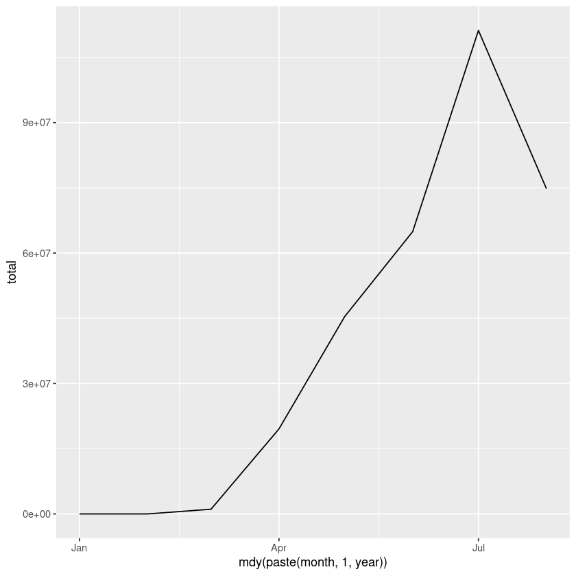
In [9]:
ggplot(us_data_gbymonth,aes(mdy(paste(month,1,year)),y=total)) + geom_line()
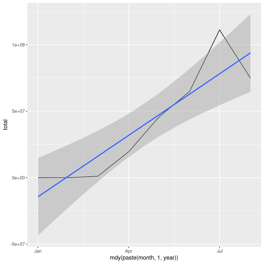
Add regression line on ggplot
Let add regression line on ggplot now. We would use stat_summary and geom_smoooth function.
In [10]:
options(warn=-1)
ggplot(us_data_gbymonth,aes(x=mdy(paste(month,1,year)),y=total)) + geom_line() +
       stat_summary(fun.data= mean_cl_normal) +  geom_smooth(method='lm')
Related Notebooks
- How To Install Python TensorFlow On Centos 8
- How To Run Logistic Regression In R
- How To Install R Sparklyr H2O Tensorflow Keras On Centos
- How To Take String Input From Command Line In Python
- How To Take Integer Input From Command Line In Python
- Write Single And Multi Line Comments In Python
- Understanding Logistic Regression Using Python
- Machine Learning Linear Regression And Regularization
- Lasso and Ridge Linear Regression Regularization