Covid 19 Curve Fit Using Python Pandas And Numpy
In this post, We will go over covid 19 curve plotting for US states.
Before we delve in to our example, Let us first import the necessary package pandas.
import pandas as pd
from matplotlib import pyplot as plt
import numpy as np
df=pd.read_csv('covid19_us_states.csv',encoding='UTF-8')
df.head(2)
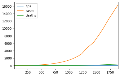
Let us do a line plot for covid 19 cases of California.
df[df.state=='California'].plot.line()
x axis in the above chart is the index number. To plot it against date, we need to set the index as date first.
Before that let us check what is the data type of date.
df.dtypes
We need to change date field from string to datetime using to_datetime() function.
df['date'] = pd.to_datetime(df['date'])
df.dtypes
Ok date field is now datetime64 type. Let us now set the date as index.
dfd = df.set_index('date')
Let us try now plotting.
dfd[dfd.state=='California'].plot.line()
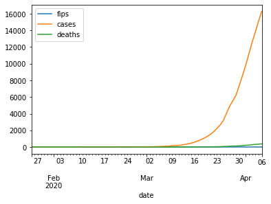
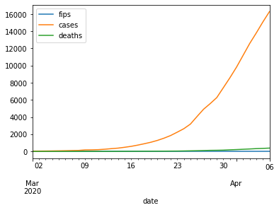
As we can see above there were no cases of covid 19 before March 2020. Also note, the x-axis looks much better now. Let us filter out the data before March and replot.
dfd[(dfd.state=='California') & (dfd.index >= '3/1/2020')].plot.line()
dfd.head(2)
Compare covid 19 curve of California with New York
To compare the covid 19 cases of two states, we need to use subplots. We will compare the data beginning March 1 2020.
fig, ax = plt.subplots()
dff = dfd[dfd.index >= '2020-03-01']
dff[(dff.state=='California')]['cases'].plot(kind='line', ax=ax)
dff[(dff.state=='New York')]['cases'].plot(kind='line', ax=ax)
ax.legend(['California','New York'])
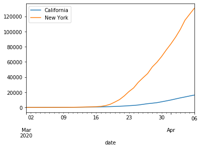
The California curve looks much less steeper than New York curve for covid 19 cases.
Let us try to fit a curve to our data for New York covid 19 cases.
We will use numpy polyfit function to do that.
cases_newyork = dfd[dfd.state=='New York']['cases']
np.polyfit needs x-axis as numeric. It can't take date as it is.
Since date is an index, we can take number of date entries as x axis as shown below.
xaxis = range(len(dfd[dfd.state=='New York'].index))
xaxis
Let us try fitting a 3 degree polynomial to our data.
coefficients = np.polyfit(xaxis,cases_newyork,3)
coefficients
Let us build a polynomial using above coefficients. We need to import polynomial package using np.poly1d.
f = np.poly1d(coefficients)
Lets us print our polynomial equation now.
print(np.poly1d(coefficients))
We will plot now our new york cases and then overlay our polynomial function on top of it.
fig, ax = plt.subplots()
plt.plot(xaxis, cases_newyork)
plt.plot(xaxis,f(xaxis))
ax.legend(['polynomial','real data'])
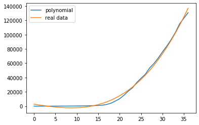
As we see above the polynomial fits very well to our real data.
Let us try fitting our polynomial function to California covid 19 time series data.
cases_california = dfd[dfd.state=='California']['cases']
xaxis_california = range(len(dfd[dfd.state=='California'].index))
fig, ax = plt.subplots()
plt.plot(xaxis_california, cases_california)
plt.plot(xaxis_california,f(xaxis_california))
ax.legend(['polynomial','real data'])
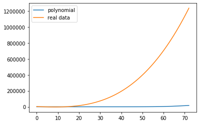
As we see above, the New York polynomial curve doesnt fit on the California covid 19 data.
Let us see which polynomial would best fit the California covid 19 data - checkout part 2 polynomial interpolation using sklearn.
Wrap Up!
I hope above examples would give you clear understanding about how to do curve fitting using Pandas and Numpy.Related Notebooks
- Polynomial Interpolation Using Python Pandas Numpy And Sklearn
- How to do SQL Select and Where Using Python Pandas
- Select Pandas Dataframe Rows And Columns Using iloc loc and ix
- Stock Tweets Text Analysis Using Pandas NLTK and WordCloud
- Summarising Aggregating and Grouping data in Python Pandas
- Merge and Join DataFrames with Pandas in Python
- How To Read JSON Data Using Python Pandas
- Pandas Read and Write Excel File
- Python Pandas String To Integer And Integer To String DataFrame