If you are new to Stock Options Vega and Implied Volatility, I would recommend visiting the following notebooks first...
Demystifying Stock Options Vega Using Python
Calculate Implied Volatility of Stock Option Using Python
We will be using following modules to do this excercise.
- pymongo (assuming mongodb is already installed)
- opstrat Python library to calculate option geeks using Black Scholes
- Python Matplotlib
For this excercise let us look at Tesla options. We will plot
- Todays date is Jan 10, 2023
- TSLA Jan 20 2023 120 Call
Let us grab the data for the last 20 days.
import pymongo
import datetime
from pymongo import MongoClient
client = MongoClient('mongodb://localhost:27017')
db = client['stocktwits']
expirationDate  = datetime.datetime.strptime("2023-01-20","%Y-%m-%d")
options = list(db.tdameritrade.find({'contractName':'TSLA',\
                                    'strike':120.0,\
                                    'option_type':'call',\
                                   'expirationDate':expirationDate},\
                                   {'bid':1,'ask':1,'last':1,'daysToExpiration':1,\
                                    'description':1,'strike':1,\
                                    'volatility':1,r'vega':1,'added':1})\
              .sort([('added',pymongo.DESCENDING)]).limit(20))
Let us look at our data now.
options[0]
{'_id': ObjectId('63bd7e41458ed237d277d4a3'),
 'description': 'TSLA Jan 20 2023 120 Call',
 'bid': 4.8,
 'ask': 4.9,
 'last': 4.85,
 'volatility': 70.574,
 'vega': 0.08,
 'daysToExpiration': 10,
 'strike': 120.0,
 'added': datetime.datetime(2023, 1, 10, 14, 0, 2, 900000)}
optionsVega = []
optionsVI = [] #implied volatility
dates = []
for option in options:
    optionsVega.append(option['vega'])
for option in options:
    optionsVI.append(option['volatility'])
for option in options:
    dates.append(option['added'])
import matplotlib.pyplot as plt
import matplotlib.dates as mdates

# Create the figure and the first axis
fig, ax1 = plt.subplots()
ax1.plot(dates, optionsVI, 'b-')
ax1.set_xlabel('Date')
ax1.set_ylabel('Implied Volatility', color='b')
ax1.tick_params('y', colors='b')

# Create the second axis
ax2 = ax1.twinx()
ax2.plot(dates, optionsVega, 'r-')
ax2.set_ylabel('Vega', color='r')
ax2.tick_params('y', colors='r')

# format the x-axis
ax1.xaxis.set_major_formatter(mdates.DateFormatter('%Y-%m-%d'))
fig.autofmt_xdate()

# Set the interval of ticks to be displayed
ax1.xaxis.set_major_locator(mdates.WeekdayLocator())

# Add a title
plt.title('Implied Volatility, Vega vs Date')

# Show the plot
plt.show()
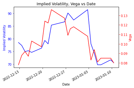
It is hard to figure out what is going on in above the plot without overlaying the stock price. Let us do that next.
stockprices = list(db.eod_stock_data.find({'ticker':'TSLA'}).sort([('date',pymongo.DESCENDING)]).limit(20))
stockprices[0]
{'_id': ObjectId('63bdb5bd458ed2765145ff69'),
 'close': 117.39,
 'open': None,
 'high': None,
 'low': None,
 'volume': 113202654,
 'date': datetime.datetime(2023, 1, 10, 0, 0),
 'adjusted_close': None,
 'source': 'tmpvalues',
 'ticker': 'TSLA',
 'perchange': -1.99}
prices = []
for stock in stockprices:
    prices.append(stock['close'])
import matplotlib.pyplot as plt
import matplotlib.dates as mdates

# Create the figure and the first axis
fig, ax1 = plt.subplots(figsize=(12, 8))
ax1.plot(dates, optionsVI, 'b-')
ax1.set_xlabel('Date')
ax1.set_ylabel('Implied Volatility', color='b')
ax1.tick_params('y', colors='b')

# Create the second axis
ax2 = ax1.twinx()
ax2.plot(dates, optionsVega, 'r-')
ax2.set_ylabel('Vega', color='r')
ax2.tick_params('y', colors='r')

# Create the third axis
ax3 = ax1.twinx()
ax3.spines["right"].set_position(("axes", 1.2))
ax3.plot(dates, prices, 'g-')
ax3.set_ylabel('stock price', color='g')
ax3.tick_params('y', colors='g')

# format the x-axis
ax1.xaxis.set_major_formatter(mdates.DateFormatter('%Y-%m-%d'))
fig.autofmt_xdate()

# Set the interval of ticks to be displayed
#ax1.xaxis.set_major_locator(mdates.WeekdayLocator())

# Add a title
plt.title('Implied Volatility, Vega vs Date,for option Jan20, $120 call')

# Show the plot
plt.show()
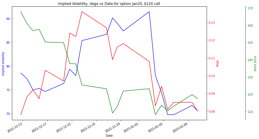
This plot shows us how vega of the option is moving with respect to stock price. We can conclude that when the TESLA stock was at 170, at that time our Jan 20 call option of strike \$120 was in the money. At this time, the vega was around 0.08. On the other side, when the stock comes near \$120 which was in the beginning of January, the vega of option was very high but as the stock price dipped below \$120 then vega of option was low again. Therefore we can say that vega was higher when the option strike was at the money.
Related Notebooks
- Demystifying Stock Options Vega Using Python
- Calculate Implied Volatility of Stock Option Using Python
- Calculate Stock Options Max Pain Using Data From Yahoo Finance With Python
- Stock Sentiment Analysis Using Autoencoders
- Stock Charts Detection Using Image Classification Model ResNet
- Stock Tweets Text Analysis Using Pandas NLTK and WordCloud
- How to Visualize Data Using Python - Matplotlib
- How To Plot Unix Directory Structure Using Python Graphviz
- Crawl Websites Using Python